Analysis Considerations
Questions to Explore
Q6-7
Comparing which VCS they started to use and when (YYYY)
- Delete all columns except 2 columns: “When did you first start using a version control system?” and “Which version control system did you start out using?”
- Create pivot table of year as rows and VCS as columns
- Values are Count of the number of respondents who started using a particular VCS per year
- Create line graph charting each VCS as separate lines, year on x-axis, and number of respondents on the y-axis. Visualizing the increase/decrease of VCS adoption through the years
- Need to code and count Other field for popular resources
Q14
Why did you first enter the world of git and version control?
- Delete columns not related to Q14
- Create bar chart of predetermined variables (e.g. I need a vcs, My collaborators Use it, and I heard it would get me a job in the future)
- Qualitiative code Other free text into 7 Reasons category
- Pivot table to count reasons incurred. From most common to least (course learning; upgrade, tech needs; collaboration, sharing; keep up with tech standards; work requirement; reproducibility; backup)
Q15
How did you learn to use version control? Check all that apply
- Delete columns not related to Q15
- Sum each column choice to the number of respondents show selected each choice
- Transpose header and sum from wide to long
- Create bar chart with header (method of learning Git) as x-axis and count of respondents (sums) as y-axis
Q16
Who taught you git specifically?
- Delete columns not realted to Q16 (kept Q17-18 for potential cross-tabulation)
- Sort by Z-A (omit blank text fields coded as “-99”) and skim alike responses
Other potential figures
Pull our specifically how specific groups of students learned how to use Git.
# get only the columns about how people learned, omit the NA values, and then filter on
# only students
status_learned <- data.frame(na.omit(output[c(32:39, 103)]))
status_learned <- dplyr::filter(status_learned, status != -99)
status_learned <- dplyr::filter(status_learned, status == 'Masters student' | status == 'Doctoral student' | status == 'Undergraduate student')

# pivot long to get the method of learning in one column with counts in the other,
# with statuses (repeating)
status_learned_wide <- pivot_longer(status_learned, cols = starts_with('how_learn'),
                            names_to = "Method", values_to = "count")

# pivot wider to put the statuses as headers, with counts of # of participants who used
# those methods as values (leaving method as a column) in case we want the chart
# learned_status <- pivot_wider(status_learned_wide, names_from = status, values_from = count,
#     values_fn = list(count = sum))

# only keep the rows where the person *had* used a tool
status_learned_wide <- dplyr::filter(status_learned_wide, count == 1)

# remove the `how_learned` prefix from methods
status_learned_wide$Method <- substr(status_learned_wide$Method, 11, 40)

# plot it as stacked bar chart
ggplot(status_learned_wide, aes(x=Method)) + geom_bar(aes(fill = status), position = "dodge",
                                              stat = "count") +
  labs(title="How students first learned Git", x="Method", y="# Participants") +
  theme_bw() + theme(axis.text.x = element_text(angle=25, vjust=0.75))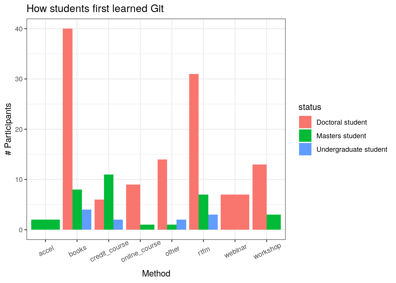
Simple histogram showing the frequency of reteaching
reteach <- na.omit(output)
reteach <- dplyr::filter(reteach, status != -99)

ggplot(reteach, aes(x=freq_reteach)) + geom_histogram(aes(fill = status),
                                                      position = "dodge", stat = "count") +
  labs(title="How frequently participants reteach themselves git", x="Frequency", y="% Participants") +
  theme_bw() + theme(axis.text.x = element_text(angle=25, vjust=0.65))
## Warning: Ignoring unknown parameters: binwidth, bins, pad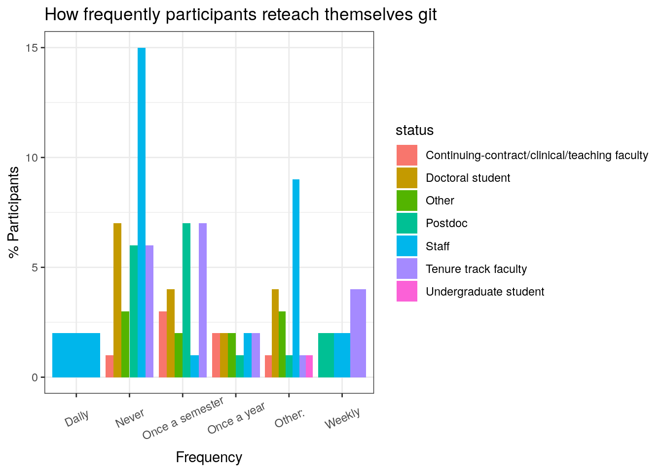
Why folks use GHPs
# get only the columns about how often they reteach themselves git and their self-rated proficiency, omit the NA values and -99s and blank cells
scholghps <- data.frame(na.omit(output[57]))
scholghps <- dplyr::filter(scholghps, why_ghps != '')

# just get rid of the colon in other
scholghps$why_ghps <- str_replace(scholghps$why_ghps, "Other:", "Other")

# plot it
ggplot(scholghps, aes(x=why_ghps)) +
  geom_bar(stat = "count", width = 0.6) +
  theme(axis.text.x = element_text(vjust=0.75, angle=90)) +
  scale_x_discrete( breaks=c("Change tracking (e.g. changes/additions to code on a macro-scale)",
                             "Collaboration (e.g. editing and updating data/code within a team)",
                             "Method tracking (e.g. documenting methodologies and protocols)",
                             "Openness (e.g. sharing data and code for open access)",
                             "Other", "Publishing (e.g. making content available online)",
                             "Version Control"),
                    labels=c("Change tracking","Collaboration","Method Tracking",
                             "Openness", "Other", "Publishing", "Version Control")) +
  labs(title="Why participants use GHPs", x="\nReason",
       y="# Participants") + theme_bw()  +
  theme(axis.title.y = element_text(angle=0))
In this graph, we want to show how people learned git.
# get only the columns about how people learned, omit the NA values
learned <- data.frame(na.omit(output[32:39]))

names(learned) <- substring(names(learned),11,)

# pivot the dataframe to get the Method_Learned and count as columns (removing status)
long_learned <- learned
long_learned <- pivot_longer(learned,cols = 0:8, names_to = "method", values_to = "count")

# convert the count into number column so we can sum
long_learned$count <- as.numeric(long_learned$count)

# count the counts and then group by the method, so we get the list of methods + counts of
# how many participants used them
long_learned <- aggregate(long_learned$count, by=list(long_learned$method), FUN=sum)

# rename the columns to what we want
names(long_learned) <- c("Method", "Count")

# plot the thing already, with %
ggplot(long_learned, aes(x=Method, y=Count)) +
  geom_bar(stat="identity", width = 0.6) +
  labs(title="How participants first learned Git", x="Learning Method",
       y="\n# Participants") +
  theme_bw() + theme(axis.text.x = element_text(vjust=0.75, angle=90)) +
  theme(axis.title.y = element_text(angle=0))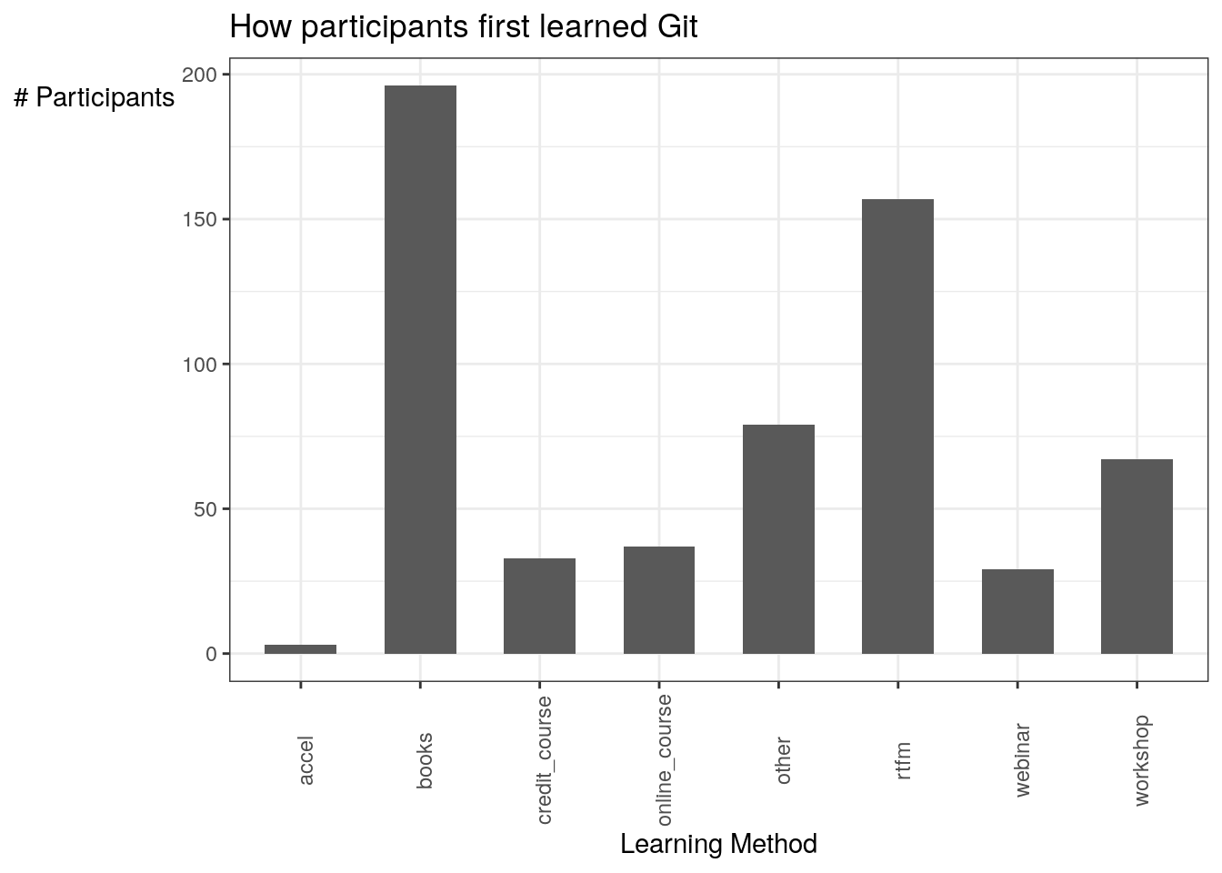
- Where people deposit code/if people deposit
- Cross those with status
- Also cross with where you learned git
- Also cross with different features of GHPs used
- Engage in scholarly activities on GHP
- Features on GHPs
- Why use GHPs
- Why of CI