Paper Plots
HICSS Paper Plotting
The following figures were generated as a part of a submission to HICSS 2020. I will first download the processed survey data, which contains survey data up until 2020-07-12. There is a raw version of this data, also in the OSF, was processed using the code in the data preparation workflow outlined here. We also provide a ReproZip bundle of this entire process to help facilitate reproducibility, also in the OSF: https://osf.io/fnh7w/.
hicss_output <- read.csv(url("https://osf.io/qx9jt/download"))

# there is a column for the participant #, which we can remove
hicss_output <- hicss_output[2:108]
Figure 1
Our first figure aims to compare q14 (why did you first enter the world of git) to q15 (how did you learn VCS).
# get only the columns about how people learned + why they learned, omit the NA values
q1415 <- data.frame(na.omit(hicss_output[c(30, 32:39)]))
q1415 <- dplyr::filter(q1415, why_vcs != -99)

# pivot the dataframe to get the Method_Learned and count as columns (removing status)
how_why <- pivot_longer(q1415, cols = 2:9, names_to = "method", values_to = "count")
how_why <- dplyr::filter(how_why, count == 1)

# convert the count into number column so we can sum
how_why$count <- as.numeric(how_why$count)

# remove the `how_learned` prefix from methods
how_why$method <- substr(how_why$method, 11, 40)

# count the counts and then group by the method, so we get the list of methods + counts
# + learning methods of how many participants used them
how_why <- aggregate(how_why$count, by=list(how_why$method, how_why$why_vcs), FUN=sum)

# rename the columns to what we want
names(how_why) <- c("method", "why", "count")

# export the dataframe for Sarah, who needs the precise counts for the paper writing
write.csv(how_why, file="results/2020-hicss/whylearn_vs_howlearn.csv")

how_why
## method why count
## 1 books I heard it would get me a job in the future. 5
## 2 credit_course I heard it would get me a job in the future. 1
## 3 online_course I heard it would get me a job in the future. 2
## 4 rtfm I heard it would get me a job in the future. 2
## 5 webinar I heard it would get me a job in the future. 2
## 6 workshop I heard it would get me a job in the future. 1
## 7 books I need a version control system. 91
## 8 credit_course I need a version control system. 10
## 9 online_course I need a version control system. 16
## 10 other I need a version control system. 24
## 11 rtfm I need a version control system. 67
## 12 webinar I need a version control system. 7
## 13 workshop I need a version control system. 29
## 14 accel My collaborators use it. 2
## 15 books My collaborators use it. 67
## 16 credit_course My collaborators use it. 8
## 17 online_course My collaborators use it. 12
## 18 other My collaborators use it. 33
## 19 rtfm My collaborators use it. 58
## 20 webinar My collaborators use it. 14
## 21 workshop My collaborators use it. 21
## 22 accel Other: 1
## 23 books Other: 33
## 24 credit_course Other: 14
## 25 online_course Other: 7
## 26 other Other: 22
## 27 rtfm Other: 30
## 28 webinar Other: 6
## 29 workshop Other: 16Then plot it!
ggplot(how_why, aes(x=method, y=count)) +
  geom_bar(aes(fill = why), position = "dodge", stat = "identity", width = 0.6) +
  labs(title="Why participants learned Git vs. how they learned", x="Learning Method",
       y="\n# Participants") + theme_bw() +
  theme(axis.text.x = element_text(vjust=0.5, angle=90)) +
  theme(axis.title.y = element_text(angle=0)) +
  scale_x_discrete( breaks=c("workshop", "webinar", "rtfm", "other", "online_course",
                             "credit_course", "books","accel"),
                    labels=c("Workshop","Webinar/online video","RTFM", "Other",
                             "Online course",
                             "For-credit course", "Books/blogs/articles",
                             "Programming accelerator")) +
  scale_fill_discrete(name="Why Learn Git",
                      breaks=c("I heard it would get me a job in the future.",
                               "I need a version control system.",
                               "My collaborators use it.", "Other:"),
                      labels=c("It'll get me a job", "Needed version control",
                               "Collaborators use it", "Other")) +
  theme(legend.position="right")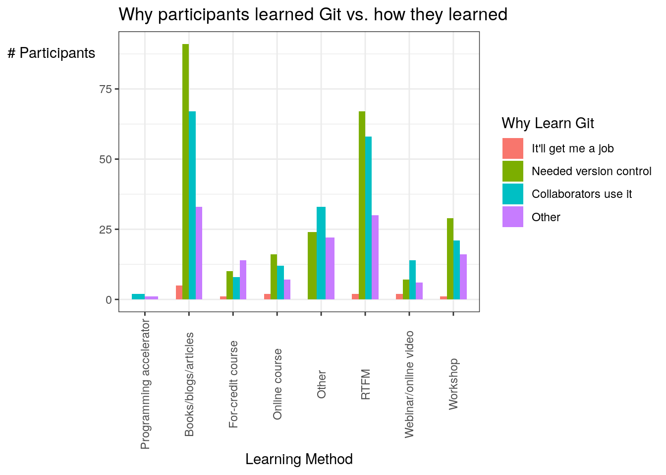
And save the plot:
## Saving 7 x 5 in imageFigure 2
The next figure examines the frequency of reteaching themselves Git compared to their self-rated proficiency.
# get only the columns about how often they reteach themselves git and their self-rated
# proficiency, omit the NA values and -99s and blank cells
fp <- data.frame(na.omit(output[c(46:47)]))
freqprof <- dplyr::filter(fp, proficiency != -99)
freqprof <- dplyr::filter(freqprof, freq_reteach != -99)
freqprof <- dplyr::filter(freqprof, proficiency != '')
freqprof <- dplyr::filter(freqprof, freq_reteach != '')

# just get rid of the colon in other
freqprof$freq_reteach <- str_replace(freqprof$freq_reteach, "Other:", "Other")
Then plot it!
ggplot(freqprof, aes(x=freq_reteach)) +
  geom_bar(aes(fill = proficiency), position = "dodge", stat = "count", width = 0.6) +
  labs(title="Frequency of participants' relearning git and their reported proficiency",
       x="\nFrequency", y="# Participants") + theme_bw()  +
  theme(axis.text.x = element_text(angle=25, vjust=0.65)) +
  theme(axis.title.y = element_text(angle=0)) +
  scale_x_discrete(limits=c('Daily', 'Weekly', 'Once a semester', 'Once a year',
                            'Never', 'Other')) +
  scale_fill_discrete (name="Proficiency",
                       breaks=c("1", "2", "3", "4", "5"),
                       labels=c("Basic knowledge", "Limited experience",
                                "Practical application", "Applied theory",
                                "Recognized authority"))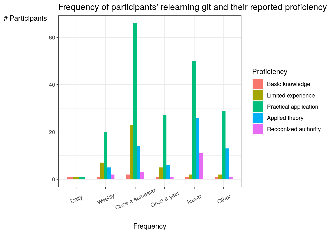
And save the plot:
## Saving 7 x 5 in imageI then get a crosstab for Sarah to do counts in paper:
wide_freqprof <- freqprof %>%
  dplyr::count(freq_reteach, proficiency) %>%
  pivot_wider(names_from = freq_reteach, values_from = n)

# export it for Sarah to do precise counts in paper
write.csv(wide_freqprof, file="results/2020-hicss/freqreteach_vs_proficiency.csv")

wide_freqprof
## # A tibble: 5 x 7
## proficiency Daily Never `Once a semester` `Once a year` Other Weekly
## <chr> <int> <int> <int> <int> <int> <int>
## 1 1 1 1 2 1 1 1
## 2 2 1 2 23 5 2 7
## 3 3 1 50 66 27 29 20
## 4 4 NA 26 14 6 13 5
## 5 5 NA 11 3 1 1 2Figure 3
This figure is a simple histogram of the scholarly activities participants engage in on GHPs.
# get only the columns about how people learned + why they learned, omit the NA values
schol <- data.frame(na.omit(output[c(77:84)]))

# pivot the dataframe to get the Method_Learned and count as columns (removing status)
schol_act <- pivot_longer(schol, cols = 0:8, names_to = "activity", values_to = "count")
schol_act <- dplyr::filter(schol_act, count == 1)

# convert the count into number column so we can sum
schol_act$count <- as.numeric(schol_act$count)

# remove the `how_learned` prefix from methods
schol_act$activity <- substr(schol_act$activity, 10,35)

# count the counts and then group by the method, so we get the list of methods + counts
# + learning methods of how many participants used them
schol_act <- aggregate(schol_act$count, by=list(schol_act$activity), FUN=sum)

# rename the columns to what we want
names(schol_act) <- c("activity", "count")

# get sarah the precise counts for paper, put it outside repo because not needed
write.csv(schol_act, file="results/2020-hicss/scholarly_activities.csv")

schol_act
## activity count
## 1 collab 221
## 2 edu 159
## 3 method 72
## 4 peer_review 98
## 5 peerprod 53
## 6 pub 118
## 7 qa 67
## 8 repro 180Then plot it!
# plot it with % instead of raw count
ggplot(schol_act, aes(x=activity, y=count)) +
  geom_bar(stat = "identity", width = 0.6) +
  labs(title="Scholarly activities participants engaged in on GHPs",
       x="Scholarly Activity", y="\n# Participants") + theme_bw() +
  theme(axis.text.x = element_text(vjust=0.75, angle=90)) +
  theme(axis.title.y = element_text(angle=0)) +
  scale_x_discrete( breaks=c("collab", "edu", "method", "peer_review", "peerprod",
                             "pub", "qa","repro"),
                    labels=c("Collaboration","Education/Teaching","Method Tracking",
                             "Peer Review", "Peer Production", "Publishing",
                             "Quality assurance", "Reproducibility"))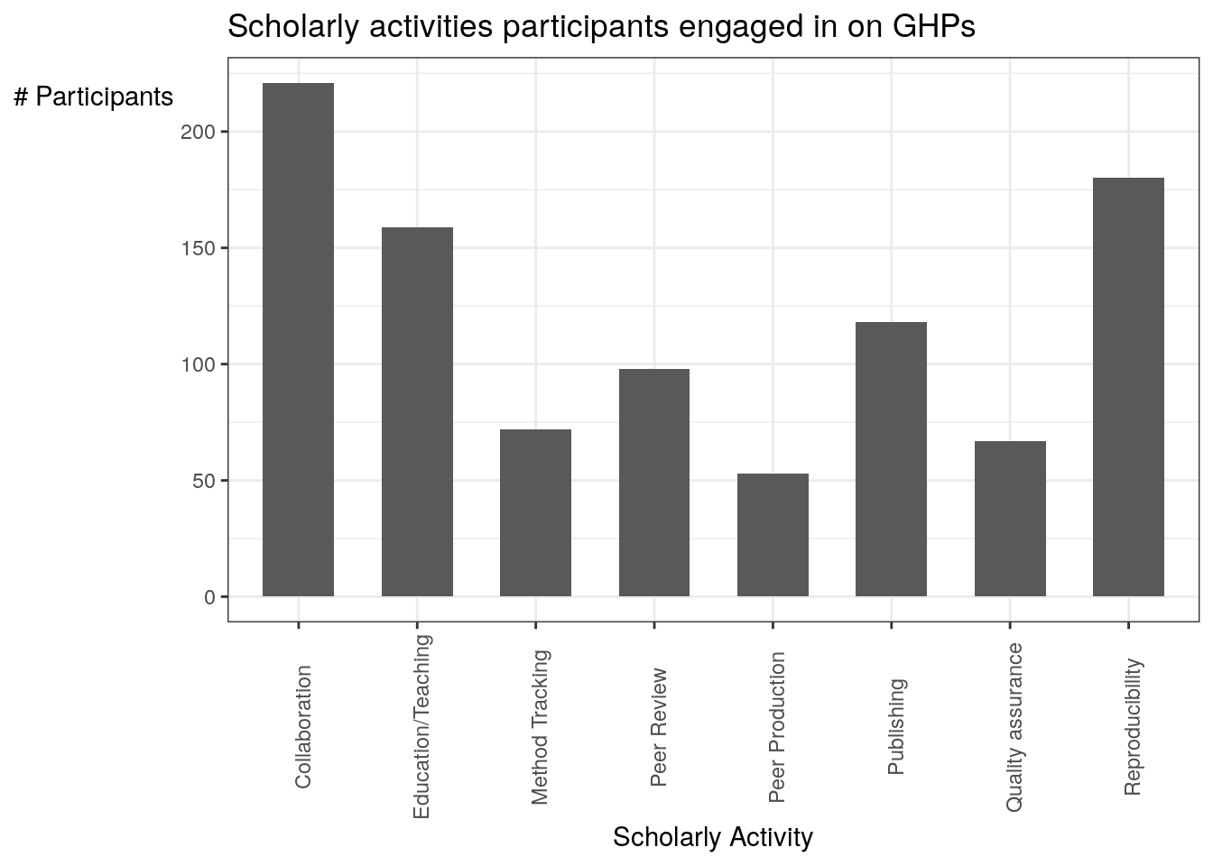
And save the plot:
## Saving 7 x 5 in image